Content Types and Settings
Before you begin
- Get familiar with how to customize rows and columns before you read this.
Overview
There are many types of content you can use in your message like text, video, social, etc. and you can customize them with settings.
- Content types that involve text (Title, Button, Text) all have some variation of the common formatting settings detailed in the common properties section below.
- In addition, all content types have configurable settings in the content properties that open to the right when you click in a content block:
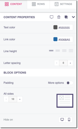
Block Options
Just like with rows and columns, you can customize the content block padding. Click here for detail.
You can also hide the content block on desktop or mobile. For example, consider your image size or video and whether it will display well on mobile.
Formatting in the toolbar vs. the content propertiesIn some cases, formatting options available in the toolbar are also available in the content properties that open when you click in a content block.
Formatting selected in the toolbar overrides formatting selected within the content properties.
Choose a content type
- Click Content.
- Drag a content type tile in to a column; it auto-adjusts to the column width. (You can alter column width in row settings).
- Click the tile in the preview pane to open any available custom settings. For descriptions of common formatting options, click here
Content type specifics
Each content type has different features and use cases, and there is some overlap depending on your personal use case. In general:
- Title: Establish hierarchies in your content, add title per section. Embed links.
- Text: Choose when you only need text, not an image, button, or icon. Consider menus for multiple text links in a row.
- Image: Embed an image (.png, . jpg, .gif) directly in your message. Link it to a web page, file, E-mail, etc.
- Button: Insert a button to link out to a web page, file, E-mail, etc. Customize the color, shape, etc.
- Divider: Separate sections with transparent spaces, or line dividers. Customize the color, width, etc.
- Social: Embed common social media icons with multiple color schemes available. Link to your social media URLs and add/delete additional icons.
- HTML: Include your own coded
HTMLsection in your email. Be careful when using customHTMLas it can affect your entire message. - Video: Embed a YouTube or Vimeo video directly in your message.
- Icons: Use available small icons or upload your own. Edit and customize the icons. Link to web pages, E-mail, SMS, etc.
- Menu: Include a horizontal or vertical list of links. Customize color, spacing, separators, etc.
Title
When you drag the title content block into your preview panel, it populates pre-populates with text for you to edit.

title block
Title specific custom settings include:
Title: When creating an email or a web page, you typically need to insert titles to establish a hierarchy in your content. You can create title blocks so that the output HTML will render those titles with heading tags (H1, H2, H3). For example:
Heading 1
Heading 2
Heading 3
Using these heading tags in HTML is important for two reasons:
- Accessibility; your customers using screen readers can navigate emails and web pages according to their headings, listen to a list of all headings, and skip to the desired heading to begin reading from that point.
- SEO for web content since search engines use headings to better understand the content on a page and rank it properly in web searches.
Font Family, Font Size,
Text
Insert text lines and format with the toolbar and content properties. Keep in mind, toolbar settings override content properties.

text block
If you're looking to create a horizontal or vertical set of links, consider using a menu.
Learn more about inserting links in to text here.
Image
Insert an image block and browse for your image in the file manager.
Read Images for more information on formatting and using images in your message.
Button
Use buttons to allow your readers to open a link, email you, call, or text:
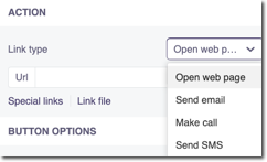
You can also link to an unsubscribe option or an image via the file manager:

Buttons also have these specific properties in addition to common properties:
- Auto-width: When toggled on, your button will match the width of the column it's placed in.
- Border radius: Use this to change the size of the rounded corners.
- Border: You can change the button border color and type or just a specific side by toggling border options to on.
Note, you can also place links in icons. Icons are the better choice if you need to edit or apply effects to a small image.
Divider
You can add a solid, dotted, or dashed line to make space in your message. Change the color, width, size, and alignment in content properties.
If you want a transparent divider, toggle transparent to on in the content properties then select a height:
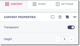
transparent divider
Social
The Social content block contains a set of four common social media icons and default links: Facebook, Twitter, LinkedIn, and Instagram.

social media icons
You can choose from a number of color schemes, and toggle More Options on to update the URLs, titles, and alternate text that displays when hovering or in screen readers. You can also add or delete icons.
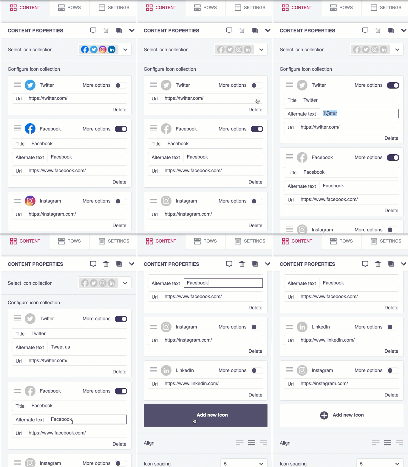
update social media customization
HTML
Though you can create dynamic, responsive emails using the other content types, sometimes you just need a little HTML. For example, if you want to use an ordered or unordered list you might want to use an HTML block. Like the rest of the content types, your HTML will render in the preview as you type it in the editor (located in content properties).
Keep in mind, using your own code here can affect the entire message's formatting so make sure you're an HTML expert, or you have an expert available to help you out. Best practice is to use an available content type before moving on to use HTML.
Video
You can embed a YouTube or Vimeo video directly in your email and the editor will grab the cover image for the video, overlay a play icon on top of it, and link it to the video content. Other video sources are not supported at this time. Also consider whether your video will display well in mobile and desktop and consider altering block padding or hiding on one view.
Video notes and limitations
- The editor can't access password-protected videos to get the cover image. If you're using a video hosted on Vimeo with the "Hide this video from Vimeo.com" setting turned on, the editor will also be unable to generate the cover image.
- This feature doesn't embed the actual video in the email, but rather links to it in a smart way. The reason why the actual video content is not embedded in the message is that, unfortunately, it doesn't work very well. Many email clients do not support it. Additionally, users tend to open emails on mobile devices. Viewing videos on a mobile device can cause substantial data usage. Not to mention that they may experience a poor user experience due to the quality of the data connection.
Once you copy a video URL into content properties, you can also choose a play icon type, play icon color, and an icon size:
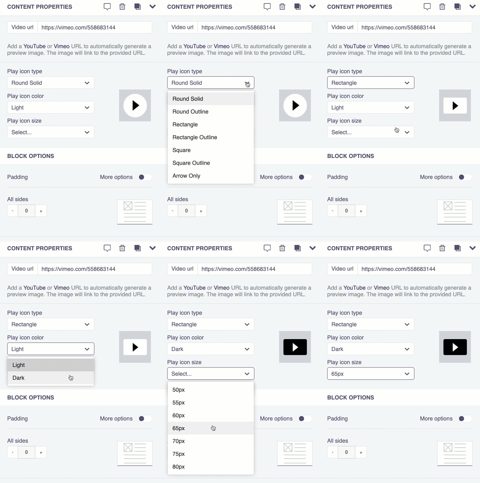
video properties
Icons
Icons are small images with lots of potential because you can apply all sorts of effects, filters, stickers, etc. on them. See Images for more detail on how to work with icon effects.
Note, if you're looking for typical social media icons, use the Social content type.
You can link an icon to a URL, Email, Telephone, and SMS. For link types, alternate text (for hover over and screen readers), and icon text, toggle more options to on in the content properties. You can also apply effects to icons.
Menu
You can use a menu to add multiple links (Web link, E-mail, call, SMS) at once, displayed with equal importance.

horizontal menu
After dragging the menu type in to your message, from the content properties click Add new item to add additional links:

You can then drag links to reorder and format common properties in addition to:
- Layout: Choose horizontal or vertical.
- Separator: Include a character(s) to insert between menu items as a separator. (In the above screenshot, we used a
-). - Mobile menu: You have the option of consolidating the menu into an icon in the mobile version that your reader can tap to expand menu items from. Toggle mobile menu to on and choose colors, icon, and size. Mobile menus will always expand vertically, however separators only display if you chose a horizontal layout:
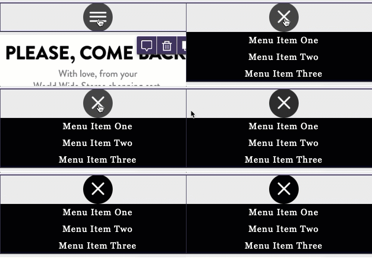
mobile menu
Link types include:
- Web page: Here you can link the text to a complete URL (http or https) or click link file to link open the file manager and select a file.
- Send email: Include a direct link for your reader to email. Include an email address and optional subject and body.
- Make call: Include a telephone number to call. Readers can tap to call depending on their device.
- Send SMS: Include a number to text. Readers can tap to text depending on their device.
For all link types:
- Target: Choose if a link should open in a new browser tab or stay in the same page. This defaults to current page.
- Title: Secondary text that appears when your reader hovers their cursor over the menu item, for example "Send us a message!" or "View our current inventory."
Updated 5 months ago
