Rows and Columns
Before you begin
Note your color hex code, you'll need it as you customize.
Quick reference
You can do a lot with row and column customization in the drag and drop editor. How you do all of this is detailed below, but if you're looking to get to the info. quick, check this list:
- Add/delete rows
- Change row and column colors, spacing
- Add text and content, change fonts, colors, etc.
- Manage views between desktop and mobile
What is a row?
Rows are structural units that define the horizontal composition of a section of the message by using columns. A row can include one to four columns. Using more than one column allows you to put different content elements side by side.
You place content within rows to manage images, links, etc.
Pro tipYour content will look differently on desktop and mobile because of the ratio. Be sure to preview in both views, and use the row properties described below to make your content work for both views.
Add and move rows
Click the Rows Tab. You'll see multiple options to choose from. Drag and drop rows into your message, based on how you want your content included. For example, if you want one image on top like a logo, drag the single content row. If you'll include some images all aligned under that logo, drag the row with a couple content blocks.
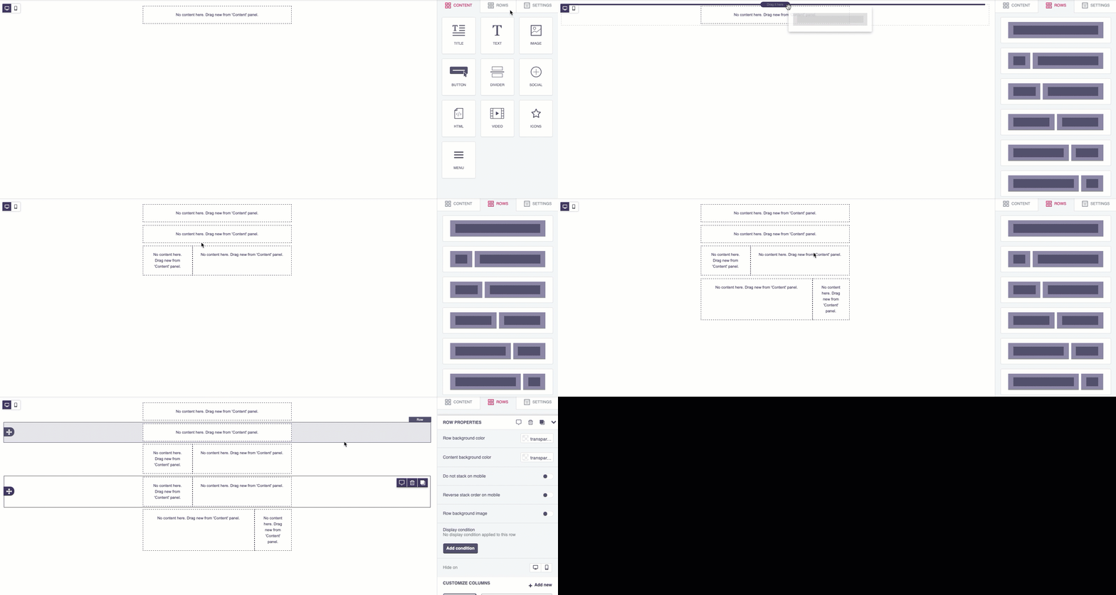
From within the row, you can:

a: Leave yourself a note or make a comment for a collaborator.
b: Delete the row
c: Quickly copy the row type.
You can also rearrange rows by dragging them on top of below each other.
You can add all the structural elements you need to your message, regardless of the template you selected when you started.
Undo and redo
You can undo, redo, or go back to a specific action. Click the arrow at the bottom left of the editor:
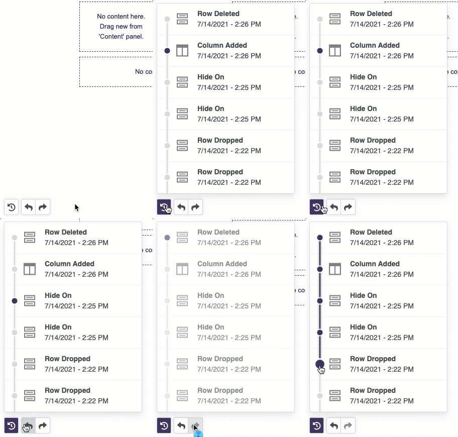
Undo and redo
Row properties
Each individual row and column has its own properties that override the general settings you set with the Settings tab. For example, you can select a background color for the entire row, only the message area, or a specific column within it.
- To configure row properties or customize columns, click within the row's individual settings.
- To exit row properties and return to your row type selection, click the Rows tab.
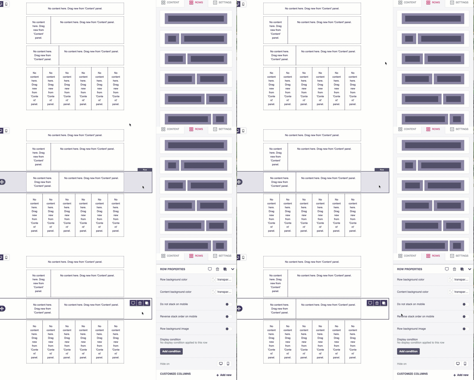
Row settings
Use row properties to customize row properties and/or column propertiesIf you don't change column properties, they inherit the row's properties just as a row inherits general settings.
Row background color
You can change the color of the row on the desktop view (row colors don't display on the mobile view). For example:
- transparent:

transparent row color
- blue:

blue row color
Row color overrides general options background colorIf you want to use one background color for the entire message, best to set it in general options and leave the transparent default on all the rows.
Be sure to check your mobile view also as not all row colors will display in the mobile view.
Content background color
You can also customize the content background color from the row properties.
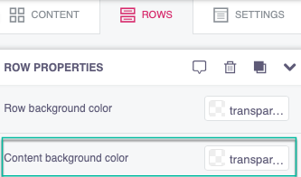
Change the content background color from the row properties
This color choice displays on both desktop and mobile and surrounds the content area.
- The content color can't override a color in an image. You'll have to edit the image itself.
- You can't change the individual content block colors, any background color choice affects the entire row.
Content background color examples:
- transparent:

transparent content color
- blue desktop:

blue content color
Stacking in mobile
Stacking refers to the content within your row. When your message is viewed in mobile, the ratio is different, so when you have a row with multiple content items side by side, like an image and some text, they'll stack one on top of the other. You have two choices to toggle on or off within the row settings:

Stack toggles
- Do not stack on mobile
- Reverse stack order on mobile
Stacking example
In the example below, we used this two column, row template:

Two column template
We added an image and text. The desktop view, within our custom width settings, looks like this:
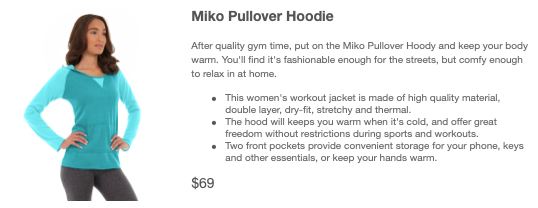
Desktop view
Within the mobile view, we have a few choices:
- Don't toggle any stack options on:

- Toggle on Do not stack on mobile:
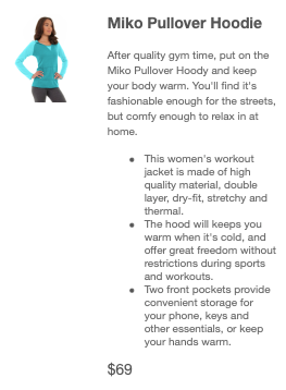
Do not stack on mobile
- Toggle on Reverse stack order on mobile:
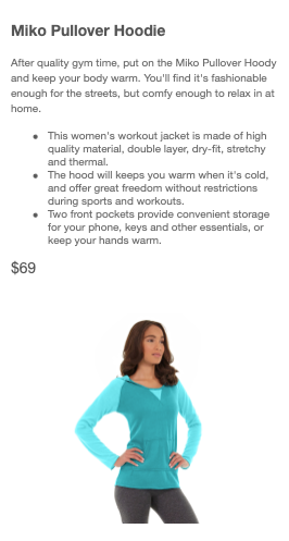
Reverse stack order on mobile
Hide on desktop or mobile view
Use this option if you want to hide a row in the desktop or mobile view.
Customize columns
In addition to row settings, you can customize the content settings within the row itself. Click the content's parent row and scroll to the Customize Columns section.
Within this section, you can:
Add and delete columns
From within the Customize Columns panel, you'll see the row's columns. The numbers indicate the column's size.
- To add a column, click + Add new
- To delete a column, click the desired column then click Delete
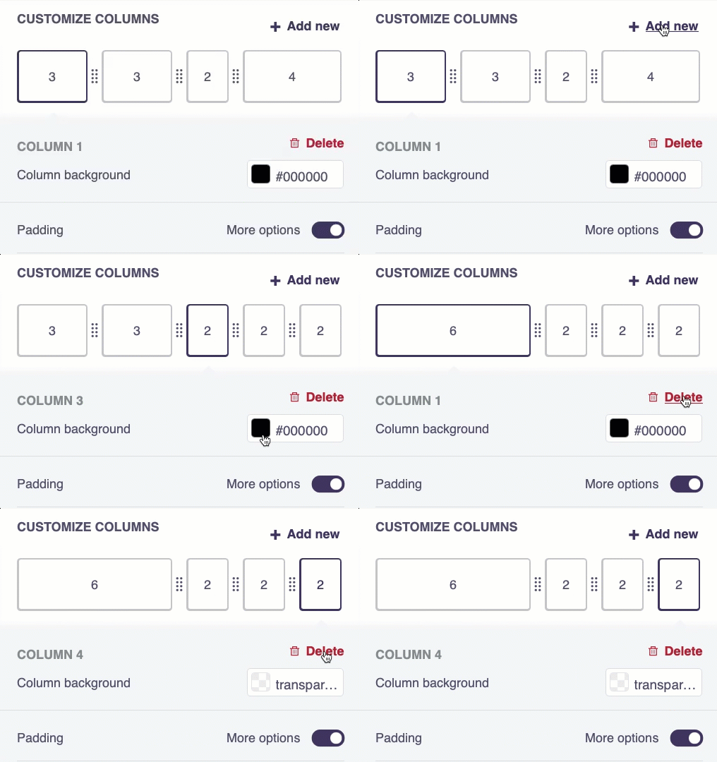
You can also customize each column's settings. Click the column you want to edit and you'll see the following options:
Padding
Padding refers to the space between the content and its border. You can increase and decrease padding in a couple ways.
To change padding for the entire column, locking the ratio (so all sides increase/decrease at the same rate), toggle Padding: more options to off, then enter your own custom padding number or use the +/- to update:
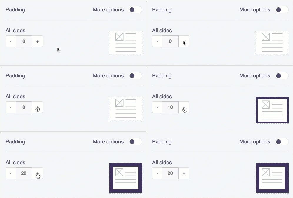
locked ratio update
To update each side individually, toggle more options to on, then edit:
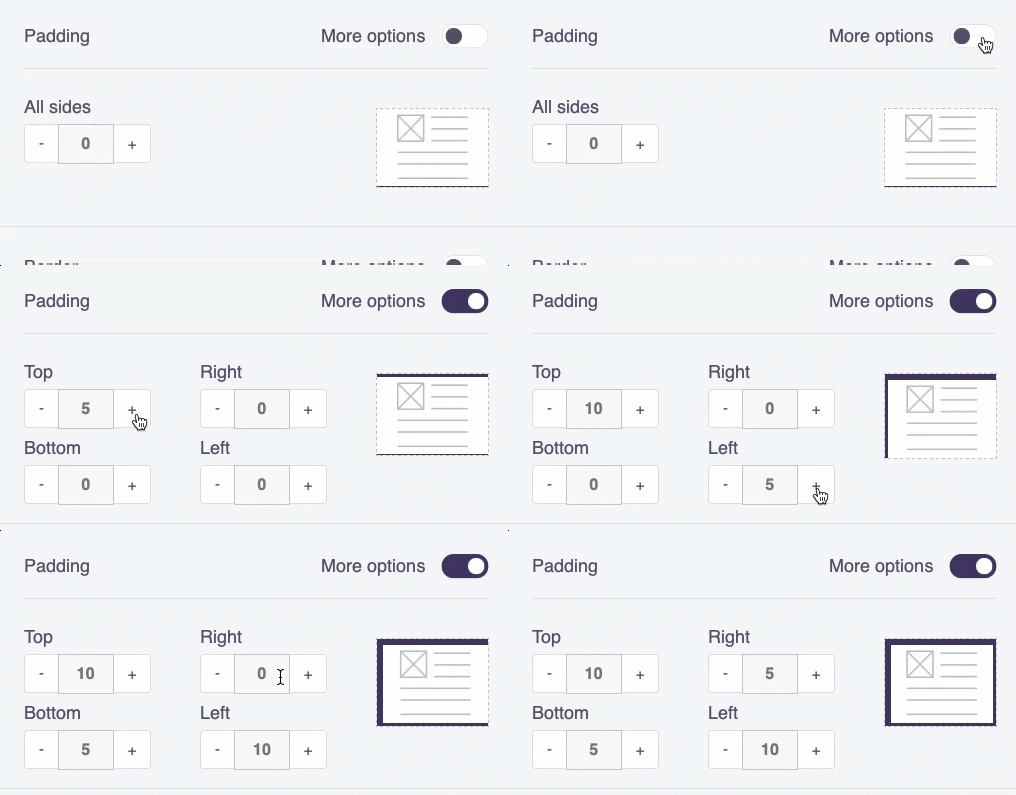
Borders
Similar to content padding, you can edit the border type, color, and size also. First, select the column you want to change the border on. To change the border consistently on all sides, leave more options toggled off, then choose a color, border type (solid, dotted, dashed), and border size.
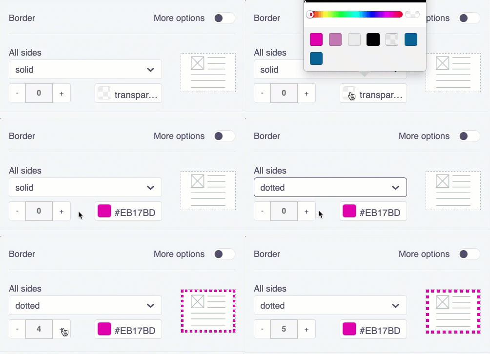
To customize the border for each individual side, toggle more options on:
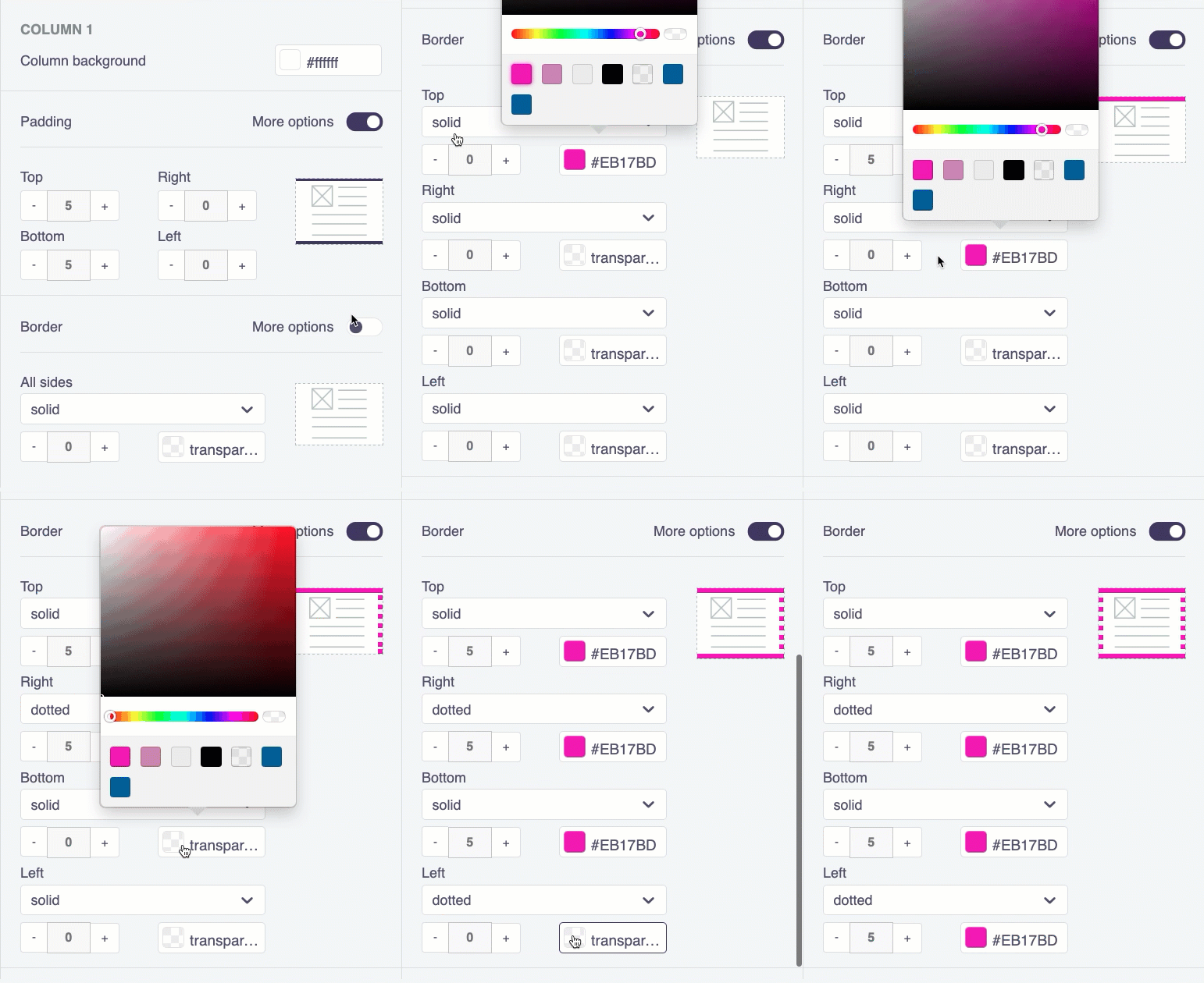
Your choices display both on the border preview (see above) and also on your email preview:
Row and column content
The only content related item you control from the row settings is the content color.
You have many content choices to choose from in your message. Review content for more detail.
Updated 6 months ago
