
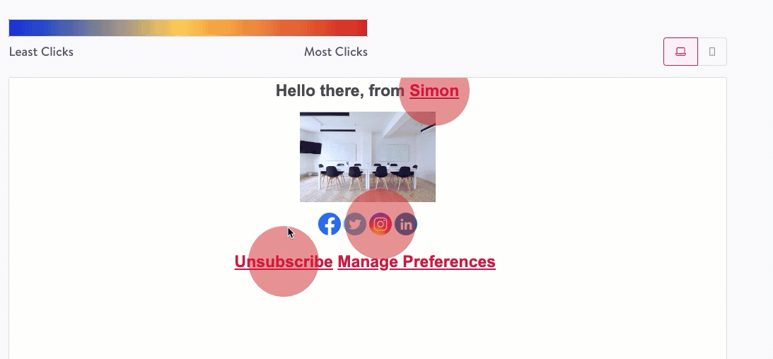
Heat Maps
Heat maps visually display what specific links are getting the most activity in your content. Heat Maps are available for Simon Mail only.
How to view
- Navigate to the flow you want to view a Heat Map for.
- Click Link Activity.
- The heat map displays on the content, with blue representing less clicks and red, most clicks. Hover over the colored circles to see the specific metrics. These metrics match one to the link activity metrics described here.
- If your flow has variants, you can switch between heat maps for each; just choose the variant from the drop down above the map.
View in templates created pre-launch
Heat Maps are available for flows that use templates, created or updated after Heat Maps launched in December 2022. However, you can still generate a heat map for a template created pre-launch:
- For a template created in the Simon Mail drag and drop editor, simply open the template then click Save to generate the map in Link Activity.
- For a template created in a Simon Template, make a small change like adding then removing a space, or removing then re-adding a character, then click Save to generate the map in Link Activity.
Note, the heat maps generated in these ways for template existing prior to the launch will only populate data for clicks going forward from the time of generation, not for any clicks prior to the heat map generation.
Updated 9 months ago
Did this page help you?